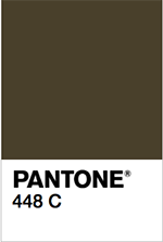
Last week I ran across a New York Times article detailing one marketing research company’s process to determine the ugliest color in the world. The winner, Pantone 448, was voted ugliest color in a survey of 1,000 smokers. As the article reports, “It was described as looking like death, filth, lung tar or baby excrement…” The purpose of this was to use that color in a social marketing campaign against tobacco—to get people to associate ugliness with tobacco use, to reinforce its detrimental health affects in a visual and subconscious way.
Yet some people have positive associations of "chocolate candy" for any dark brown color. How can you and your team decide on the best combination of marketing with color and effectiveness for your next project?
The "ugliest color equals tobacco" project is a visceral example of a process every marketing team has been through, and one which your company likely to be well aware of. When developing a marketing strategy, color matters. Research matters. Color choice is subjective if you are talking about someone’s favorite color. But color choice should not be a personal preference when assessing the marketing impact of one color versus another for a specific product, company identity, headline choice, website application, etc. You need to let go of your preferences in favor of what the research shows — for this particular project, specific application and audience.
Color Theory and Psychology
This is not to be a treatise about color psychology or color theory, because that would require way more time than I have to write this post. Suffice it to say, though, some knowledge of the associations, emotions and impacts color can have on your customer is important to consider.
Classic color choices are all around us. Stop lights and stop signs are red because it is an alarming, provocative color in Western cultures. Caution signs, traffic lights, safety vests and school buses are yellow to get us to pay attention and hopefully proceed cautiously. Green lights give us permission to proceed, as a field of green grass invites a stroll. Research shows each color family has specific effects on the human experience and therefore appeals to certain demographics and has appropriate marketing applications for specific customer segments.

Your Customer is not a Cardboard Cutout
The easy way out is to assume it’s a simple equation: How do you market to women? Use pink. How do you market to men? Use blue. Truth is, it’s much more complex than that. Reductive, clichéd or stereotyping approaches often ignore the whole picture. In a recent article, Fast Company quotes “Companies who think that marketing to women involves designing with pastel colors and pink bows are going to alienate the majority of their markets.” Bottom line is there are no concrete rules, only generalizations. Your research and testing is key, and asks the questions which women? Which men? What income level, what ethnicity, what skill set, what cultural concerns? Gender diversity, cultural diversity, and rapidly changing societal norms have created multifaceted consumers who will not respond favorably to a pigeonholing marketing approach.
Your Color Palette: An Essential Resource
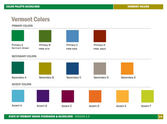
Your brand standards and guidelines contain a color palette, which serves as a guide when choosing colors for any marketing application. Consisting of primary, secondary and accent colors, the well-researched palette eliminates guesswork and assures consistency and impact across all your marketing materials. Here's an example of a palette we use often, the official color palette for State of Vermont marketing materials, excerpted from the State of Vermont Brand Standards & Style Guide:
Product colors affect sales
The new iPhone just came out, and you’re thinking “what is up with rose gold? I hate rose gold” Fortunately there’s a white and black version also. Many people consider color one of the most important factors when shopping for a new car, sometimes because of the residual value of that car at resale. Color choice in marketing is not the whim of some designer, it is based on marketing strategy informed by customer research.
Cerulean Blue
One of my favorite movie moments is from The Devil Wears Prada. Here is Meryl Streep’s snarky soliloquy on a very specific color’s recent history in the fashion industry, as she condescendingly posits Anne Hathaway’s supposedly fashion-agnostic sweater “choice” has been made for her:
What I love about this, (other than Meryl Streep’s pointed, masterful delivery) is learning about the substance, depth and money that’s behind a color choice—it’s obviously not a frivolous decision—and the viewer is left pondering whether the fashion industry was responsible for the value and popularity of cerulean blue, or whether the market responded because the color touched them in a way that was irresistible.
Research matters. Color matters.
So how does this affect your identity design, email newsletter, or your next promotional campaign? Color choices for various elements like call-to-action buttons, headlines, body copy, and so forth will be driven by readability and effectiveness research, but still need to be harmonious with your brand personality's overall look and feel. Make sure that the research shows your color palette is attractive to your primary customer or the persona to whom you’re marketing, pure and simple.
Four Things to Remember:
1. What is known about the color preferences of your audience?
2. What is the color palette of your brand personality?
3. What is the function and context of the color use?
4. What does your research and testing show?
Here are some great, in-depth articles on color choices:
How to Get Smokers to Quit? Enlist World’s Ugliest Color
The Psychology of Color in Marketing and Branding
True Color— Breakdown of Color Preferences by Gender
Why is Facebook Blue? The Science Behind Colors in Marketing.