
Why You Shouldn’t Dismiss Plain Text Emails (And How to Make Them Engaging)
Email marketers like HTML emails due to their attention grabbing graphics, fonts, and colors. But there’s still a time and place for the simplicity of plain text emails. What they lack in visual appeal they make up for in reliability and deliverability. And sometimes, it’s good to return to the basics for maximum effectiveness.
What are plain text emails?
Plain text emails are just that—simple emails that only include plain text. They are the email equivalent to a letter written on a typewriter—no images or fancy fonts—just standard text. And while they may not be nearly as attractive as HTML-based emails, they play a significant role in a well-rounded email marketing strategy.
In this post, we’ll give plain text emails the attention they deserve—focusing on why they’re important and how to properly build them, while providing plenty of plain text email examples along the way.
- Are emails still sent in plain text?
- How do I make a plain text email?
- Tips for making plain text emails scannable
- A plain text email template to get you started
Preview your HTML and text emails Want to see how your emails look in plain text as well as in HTML on popular desktop, mobile, and webmail clients? Never forget to include plain text as part of your next email campaign with Litmus Test. |
Are emails still sent in plain text?
One reason you should still use plain text is: Many emails are automatically sent with them! Even when you’re sending out an HTML email, a plain text email version is crucial. Multi-part MIME (Multipurpose Internet Mail Extensions)—the protocol that allows for sending all of our email marketing campaigns—bundles together a simplified plain text version of your email along with the HTML version of your email.
Unless you’re sending out a solely plain text email (which is relatively rare), you should focus on creating a good subscriber experience in both your HTML and plain text emails.
Here are reasons why plain text emails are still needed:
- Spam filters like to see a plain text alternative. HTML-only emails are a red flag for spam filters. A lazy spammer wouldn’t take time to create a plain text alternative, so make sure you do!
- Some people simply prefer it. Plain and simple—some people prefer text-only emails. Since a variety of email clients give the option to only receive the text version of an email, it’s important to send in multi-part MIME format. Otherwise, subscribers may not receive your email at all.
- Some people see HTML emails as a security and privacy risk. and these subscribers may choose not to load any images.
- HTML emails require more bandwidth. The increased bandwidth (and storage space) that image-heavy emails tend to consume is another driver of why people may prefer plain text.
- Plain text versions may work better for non-traditional inboxes. Smart watches, gaming devices, and voice assistants are all likely to use plain text emails over HTML when displaying or reading emails to users. A properly written and formatted plain text email will work much better on Apple Watches than the HTML equivalent, and they’re more likely to work in future non-traditional inboxes.
We’ve seen a lot of research and debate over the years about plain text vs. HTML emails, including our own A/B test, but most of it is inconclusive. While most email marketers prefer HTML versions over plain text styles, the email community is split on which approach is best.
How do I make a plain text email?
Fortunately, creating good plain text email is relatively easy. Most email service providers (ESPs) allow you to add or edit the text version of your campaign. Some include tools that automatically generate plain text when you upload your HTML.
But even if they don’t, creating your text version requires a minimal time commitment, and a text editor—which every operating system includes by default. You may want to create your own text version anyway since the auto-generated versions tend to look like a garbled mess.
What happens when you don’t include a text version?
If your HTML-only email happens to make it to your subscriber’s inbox, and they’re unable to view HTML emails (either by preference or because of their email client’s capabilities), what will they see?
If an email client or app can only show the plain text version of an email, but no plain text version exists, most email clients will either show the raw HTML of the message or try to format it into plain text. Both scenarios create a less than ideal subscriber experience.
When researching examples for this post, we were surprised by the number of senders not using multi-part MIME—including brands who otherwise excel in their email marketing strategy. Between deliverability and accessibility issues, sending in that format should be a no-brainer.
We also found that a number of companies are technically sending in multi-part MIME, but the plain text version is completely blank. For example, check out this email:
Tips for making plain text emails scannable
A key to a good email is scannability—the quality of being easily read and understood by subscribers. This applies to both HTML and plain text versions.
Most ESPs will send in multi-part MIME automatically or walk you through setting this up as an option. However, their auto-generated text versions are usually unorganized and difficult to read.
For example, the plain text email below is filled with back-to-back links. There are no clear calls-to-action (CTAs), and it is overall a poor subscriber experience.
While using these auto-generated versions can save you time, be sure to take a few minutes to edit them as needed. There may be added spaces between paragraphs, corrupted characters (ASCII characters such as trademark, copyright, and smart quotes, etc. that may not be supported), and links and text that are unnecessary.
Whether you’re creating the plain text version yourself or using the auto-generated version from your ESP, it’s important to make sure the email is easy to skim and actionable. Without HTML design elements like background colors, larger text for headlines, and imagery, you must use other elements to achieve readability.
Scannability usually consists of short, succinct copy, ample whitespace between sections, and clear headings that can be quickly glanced over by subscribers. This is usually achieved with CSS in email campaigns, but since we’re using only text, we need to rely on other techniques to create scannable emails.
Here are our tips for making your plain text emails more scannable:
- Use clear headers to separate sections
- Avoid using line breaks
- Take advantage of white space
- Format with bulleted lists
- Have clearly defined CTAs
- But don’t overdo it with links
- Have some fun
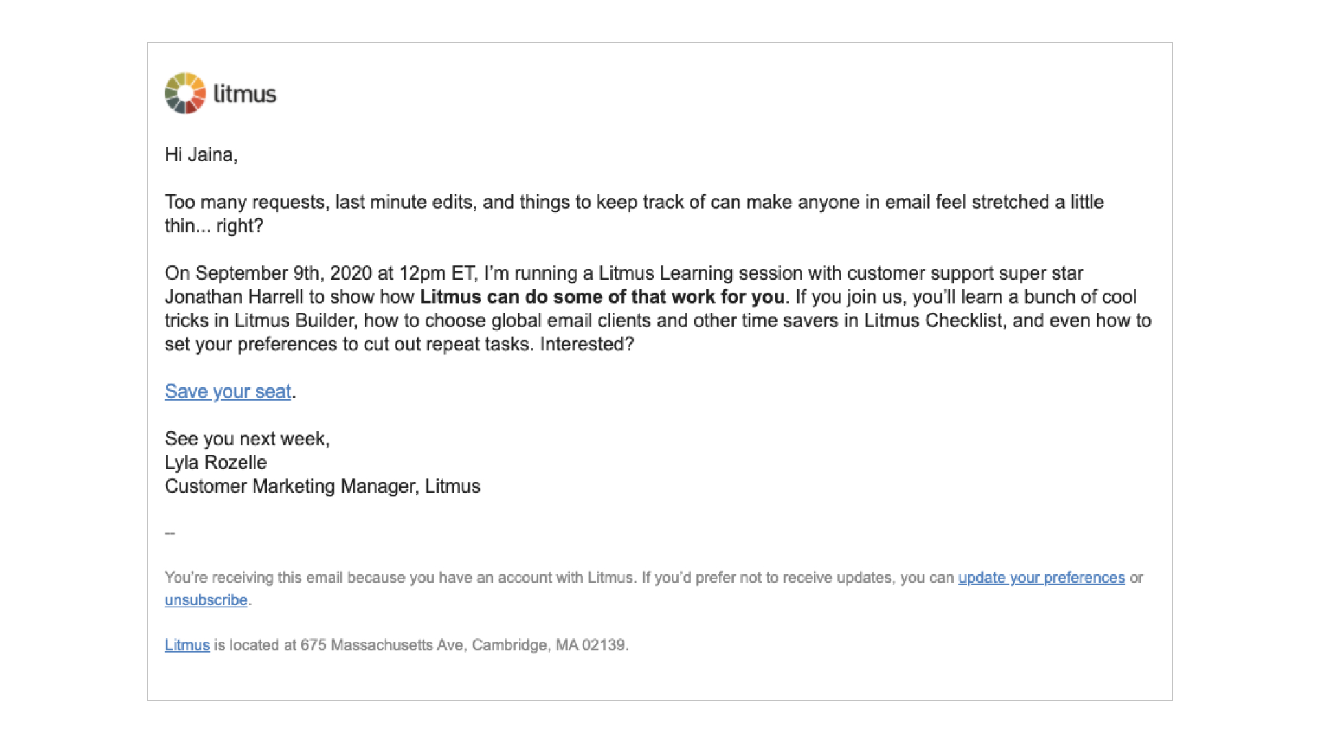
1. Use clear headers to separate sections
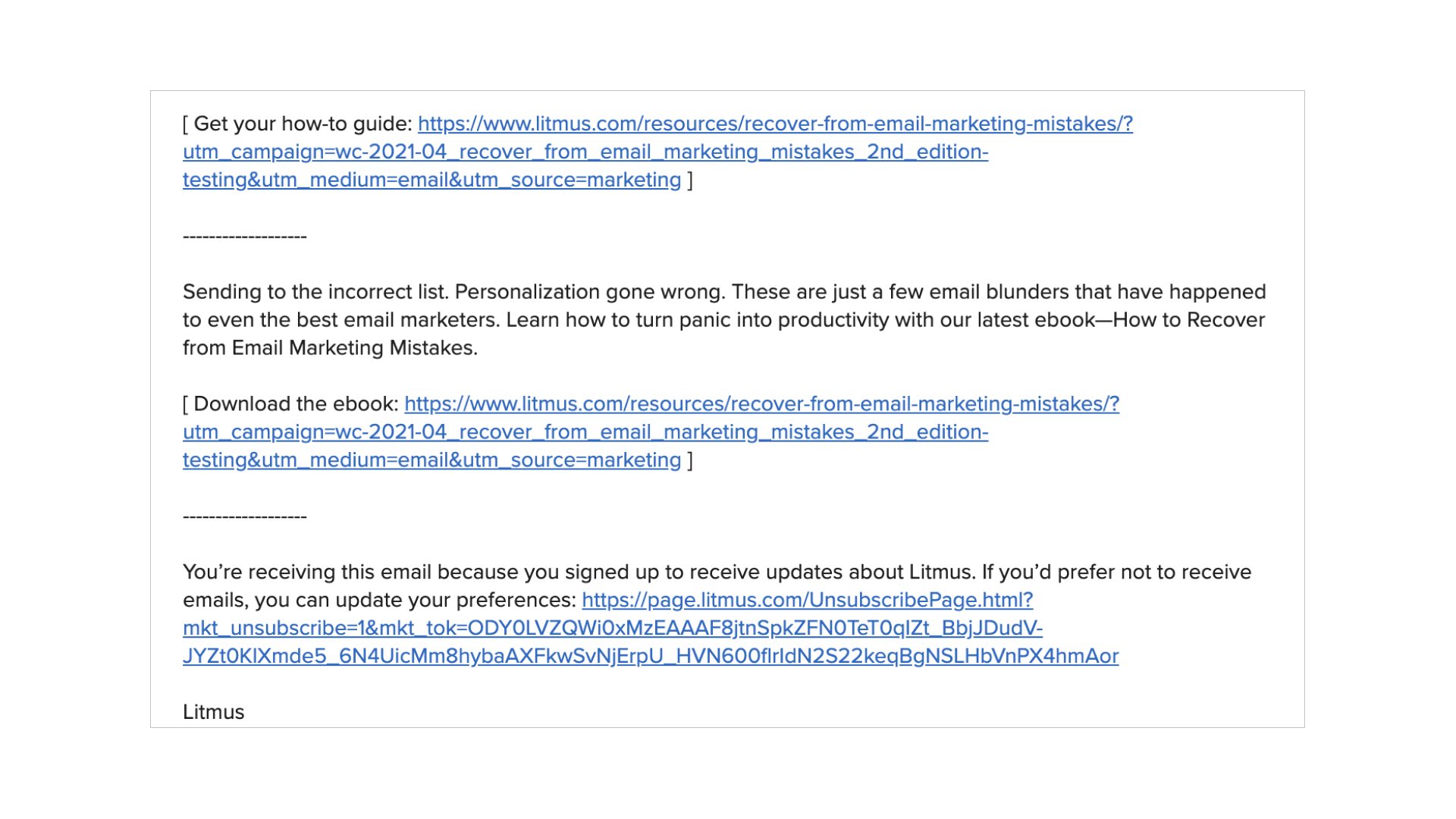
While you can’t use larger text or different colors to separate headlines from the content, there are other strategies that work. Try using all caps or symbols to separate sections.
For example, the headlines in this example are clear and stand out:
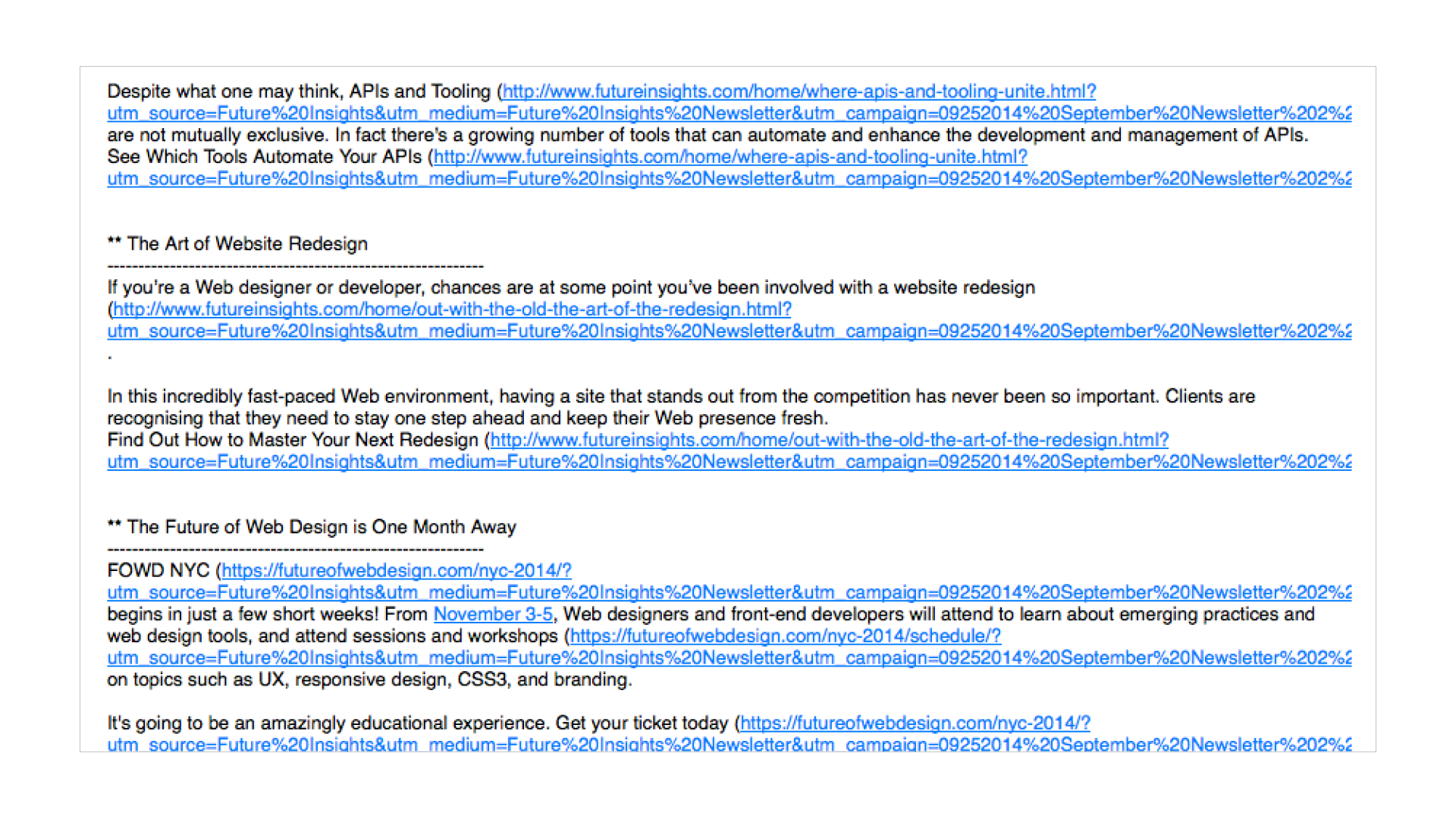
With the double asterisk (**) next to each headline and a row of dashes underneath, the headers are clear, which makes the email easy to scan.
You could also use octothorpes (or hashtag or pound symbols, depending on where you’re from), which may be familiar to a lot of people who use Markdown for formatting documents. Markdown uses a set number of octothorpes to denote specific heading levels (e.g. # is Heading Level 1, ## is Heading Level 2, and so on). Not only does this provide a clear device for scannability, but it also provides some semantic context for the importance of those headings .
If you don’t have defined headlines in your plain text email (or your HTML), your subscribers won’t have a clear reading (aka skimming) path.
Create headings if they’re not already there: adopt a convention for styling those headings in plain text, and consistently apply that convention across campaigns. Your plain text subscribers will thank you for it!
2. Avoid using line breaks
In the past, many email clients allowed text to run extremely long before wrapping it to a new line. As a result, it was a best practice to add line breaks about every 60 characters in plain text to increase legibility. However with more modern email clients (especially an influx of mobile clients), text is typically prevented from running too long or is resized to fit in the window.
Using line breaks can make your email look awkward and raggedy: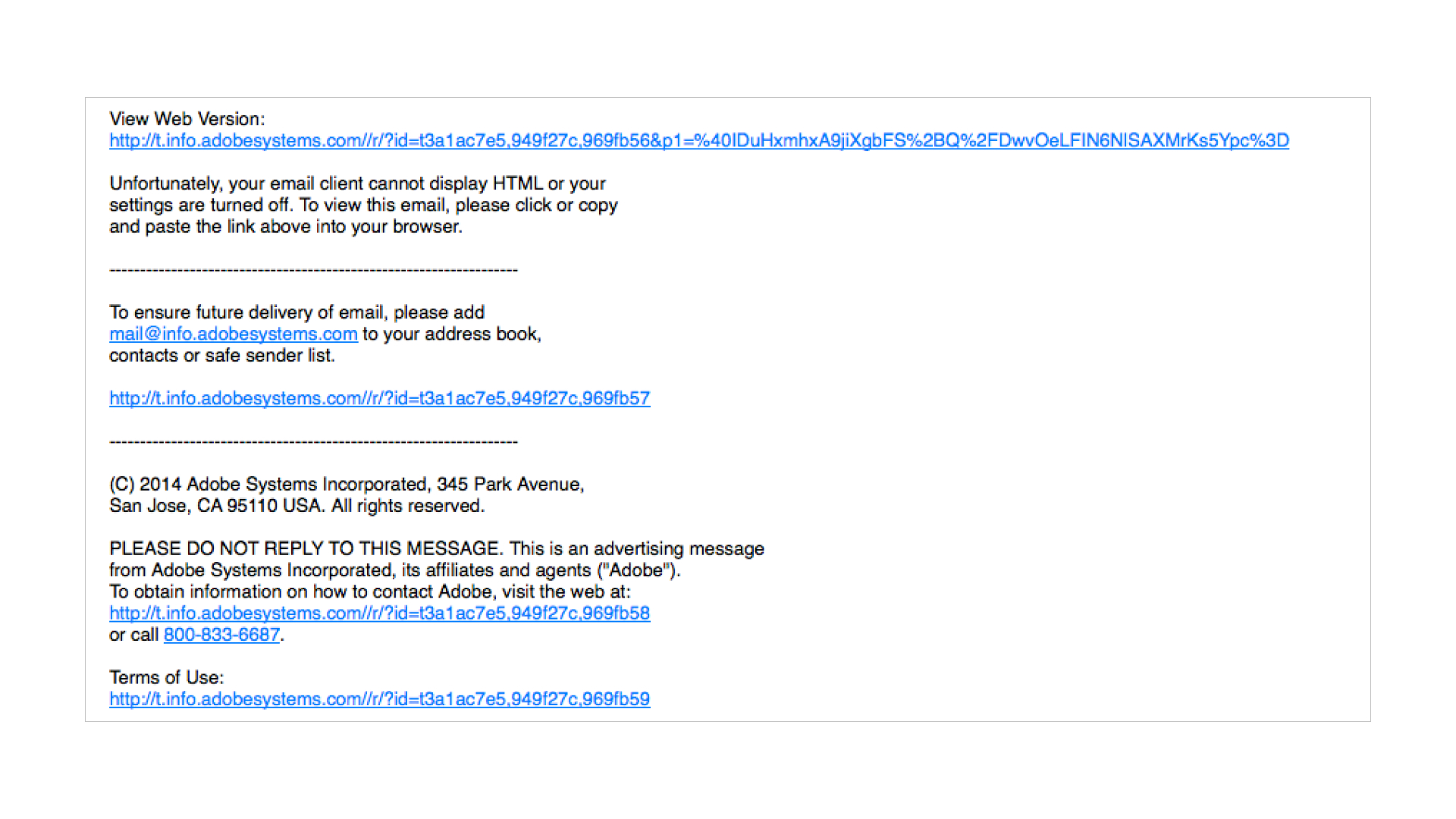
Don’t waste time using line breaks—except when introducing whitespace between elements and sections. Speaking of whitespace…
3. Take advantage of whitespace
Another important element for scannability is whitespace—which involves including line breaks between different content sections, headlines, and CTAs. On top of creating clearly defined sections in your plain text email, whitespace allows links to be easily clickable and touch-friendly on mobile devices.
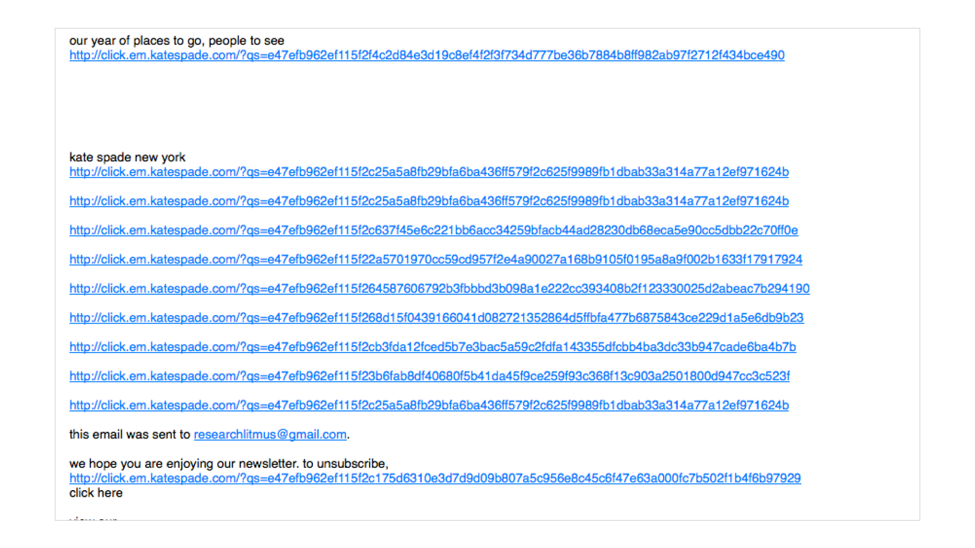
Don’t do this: This plain text email has virtually no whitespace—making it difficult to read and follow any of the CTAs.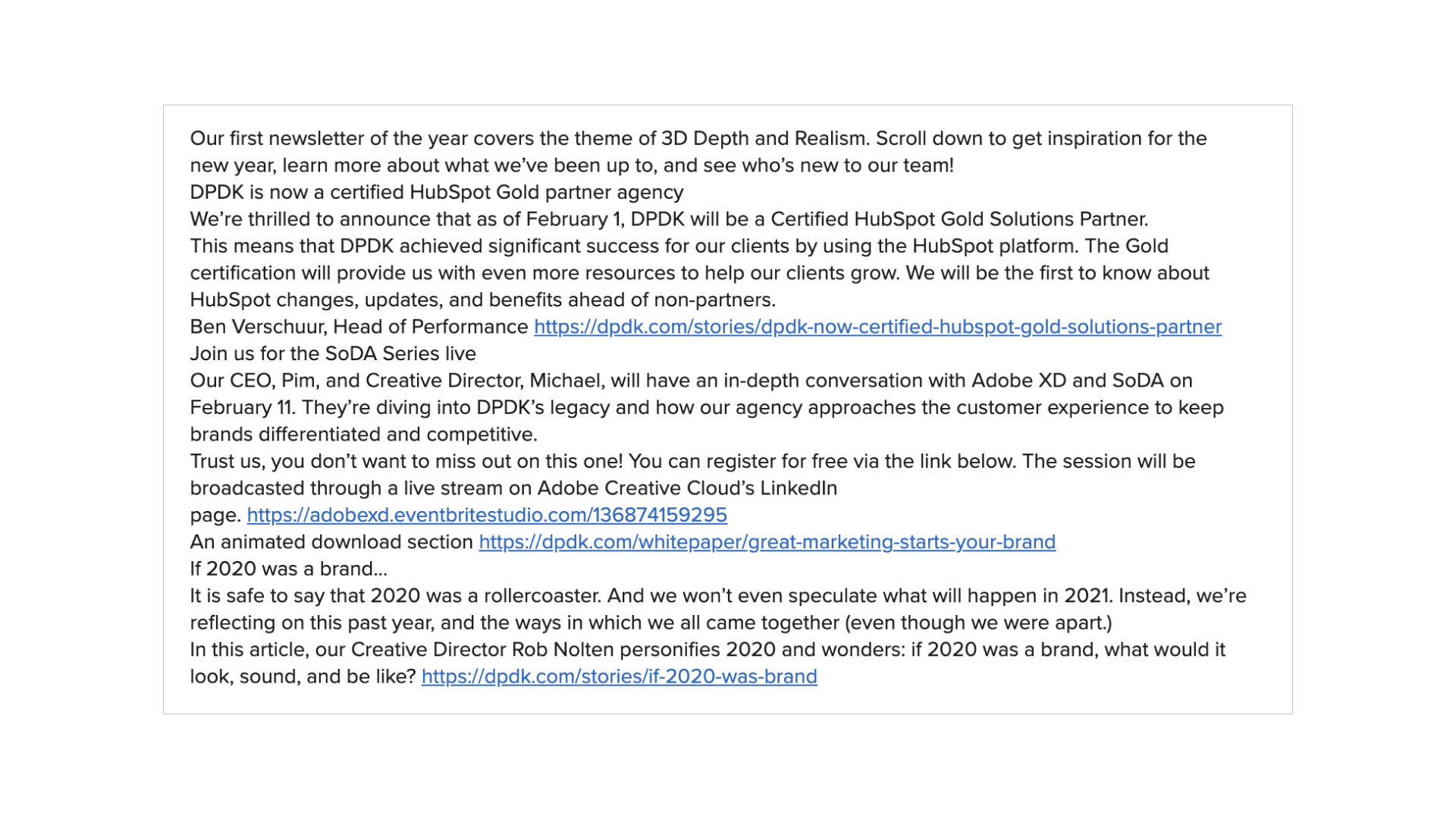
Do this: This example uses whitespace appropriately between paragraphs, links, and even equal signs (=) to create a hierarchy.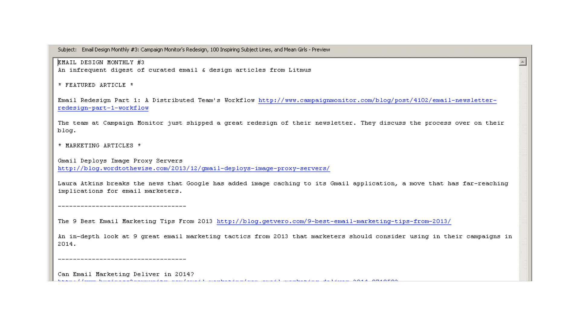
4. Format with bulleted lists
Using lists is another great tactic for creating hierarchy in a plain text email. While actual bullet points aren’t supported, you can use other characters like -, *, or + instead.
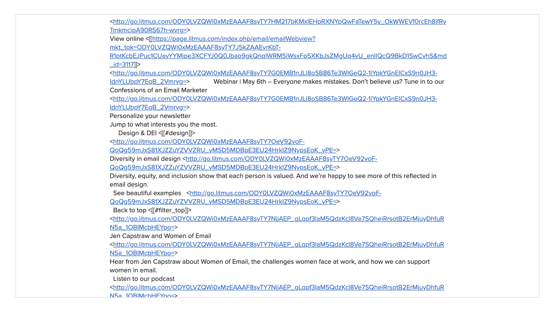
For example, this email’s plain text uses dashes to list special features included in a particular deal: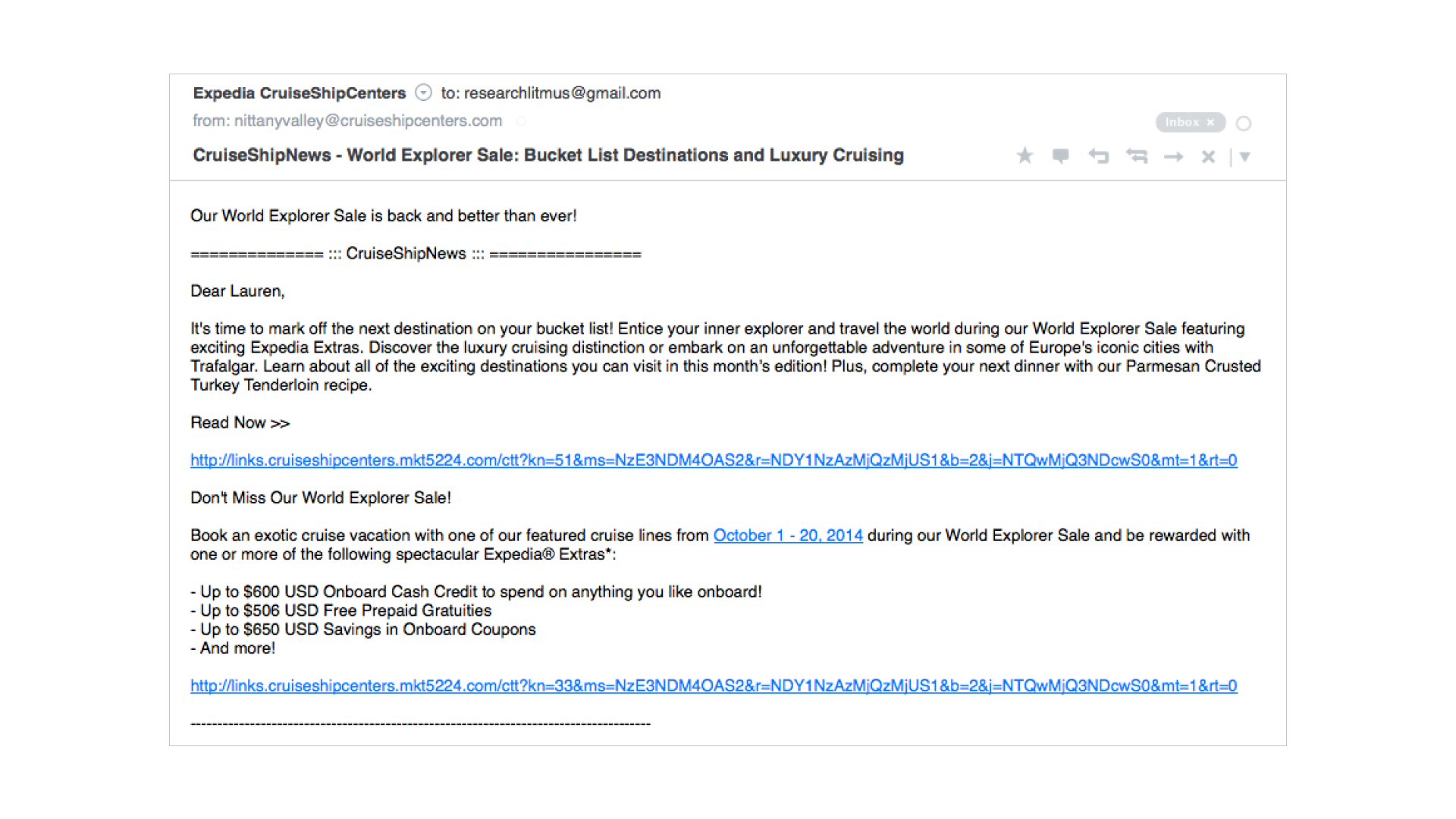 By using dashes, the hierarchy of the email remains intact—despite the lack of HTML elements—and the reader’s eye is drawn to that aspect of the email.
5. Have clearly defined CTAs
It doesn’t matter if you’re sending an HTML or plain text email: your CTAs should always stand out. Don’t make your subscribers hunt for them!
For example, in this first email, all of the links and CTAs are similar and nothing stands out: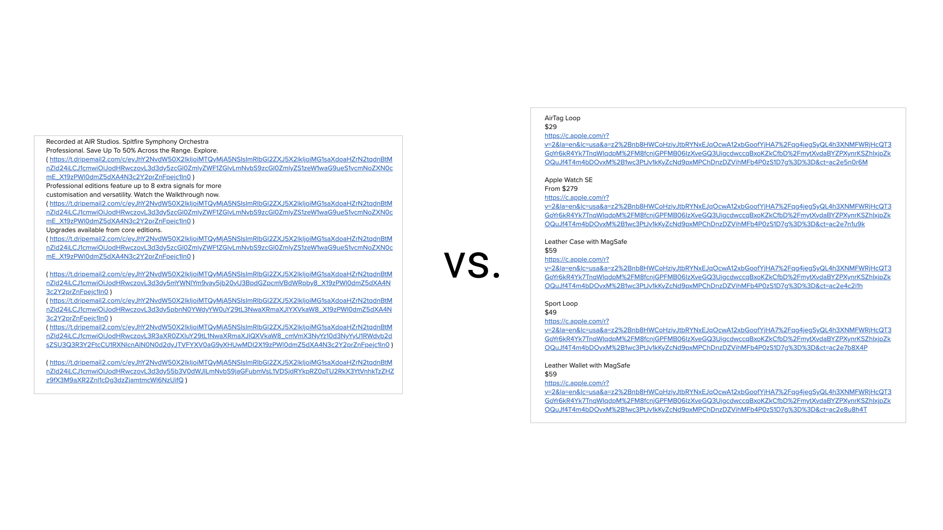 While it’s a bit more difficult to make CTAs stand out without the help of colorful, HTML-based bulletproof buttons, there are other tactics you can use for plain text.
The second example uses text, prices, and line breaks to make the email readable and the CTAs stand out in the email (and it’s easy to tap for mobile subscribers).
6. But don’t overdo it with links
If you open up an HTML-based email and it’s full of CTA buttons, you’d be overwhelmed. If you open up a text-only email and it’s full of links, you get the same reaction.
Not only are the links not labeled, but there are so many of them!
While there’s no set-in-stone rule for this, the minimalist link approach is how we present links in plain text. This provides subscribers with a better email experience: 7. Have some fun
Plain text emails don’t have to be boring! Take a page out of the internet’s history and bring back ASCII art in your text emails. ASCII art is artwork that creates illustrations using just text characters.
For example, this quick portrait of The Beatles from Christopher Johnson’s ASCII Art Collection: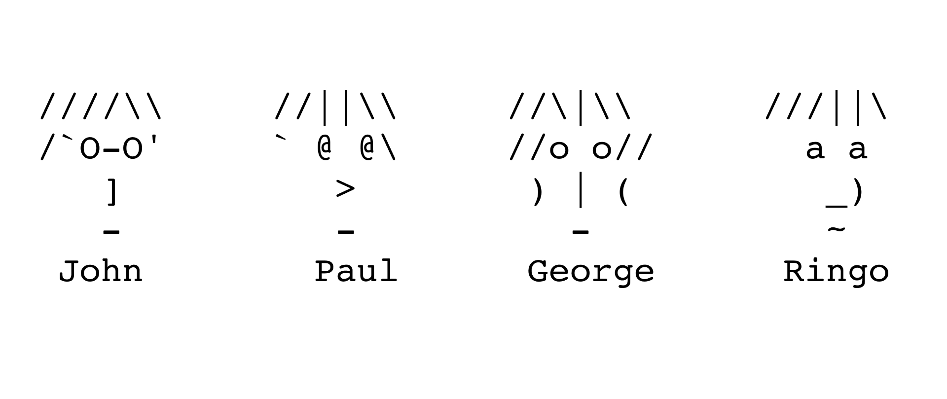 You can include ASCII graphics in your own plain text to create a sense of delight for your subscribers. There are even online tools like this ASCII art creator that allow you to upload graphics and will generate the ASCII art for you, making it easier than ever to create plain text campaigns that stand out in the inbox.
Other minimalist approaches
When researching examples for this post, we noticed many brands kept their text emails extremely simple and only included a URL to view the full email in a web browser. While this is, undoubtedly, a better approach than not sending in multi-part MIME at all (or sending a blank text version), it still feels a bit careless.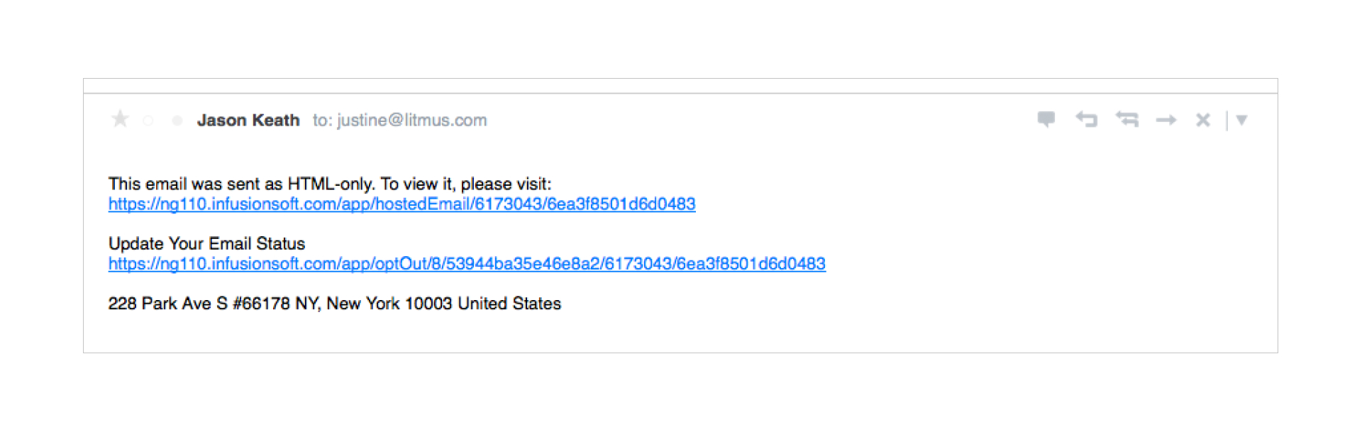 While it’s definitely a time saver to plop in the “view in browser” link, it’s worth a few extra moments to honor your subscriber’s preferences.
Another approach we saw was the practice of including only the main CTA, as well as the view in browser link, in the plain text version. This seems like a nice middle ground—providing your subscribers with content from the HTML part of the message, without spending a lot of time formatting it: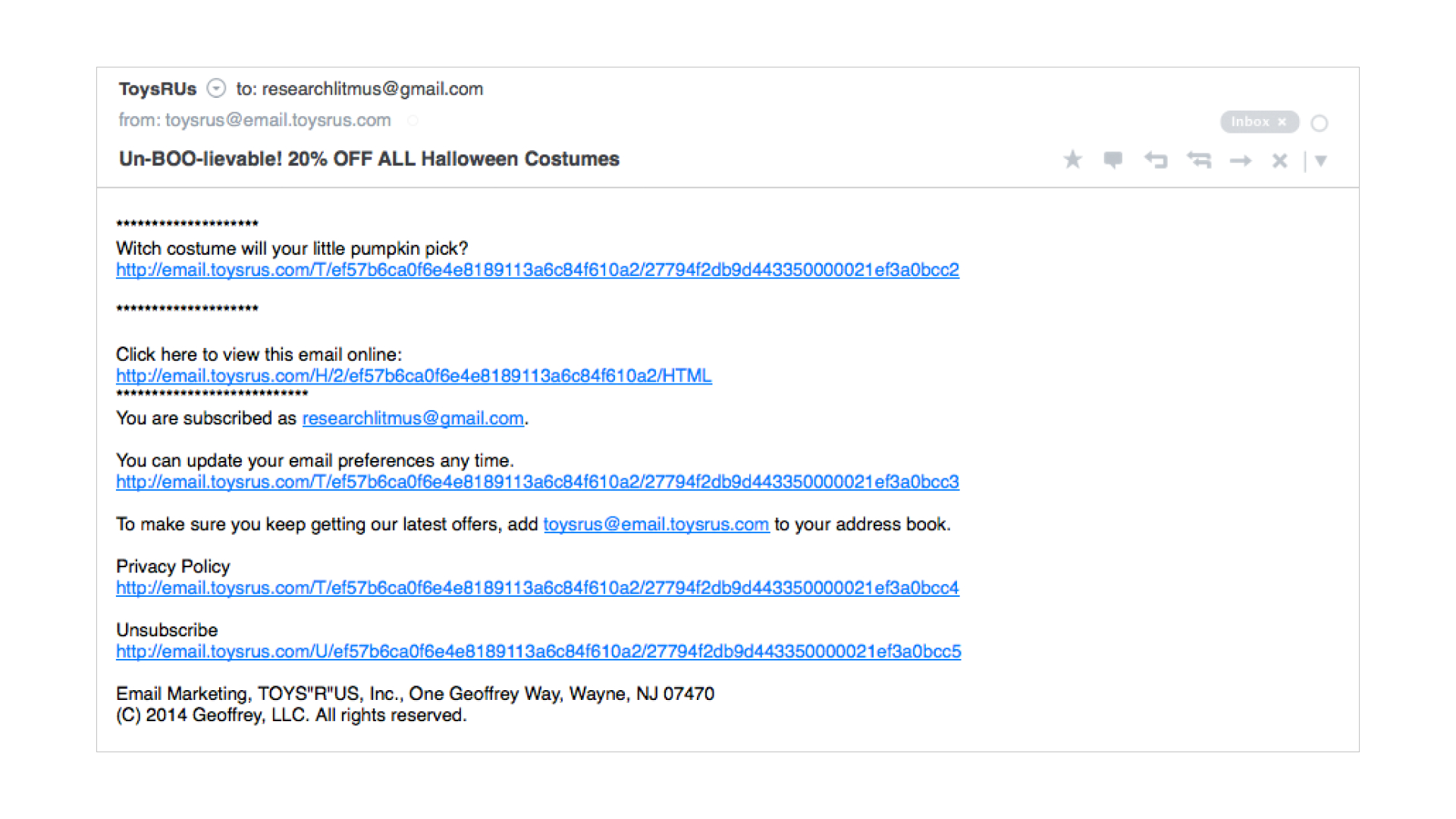 While the HTML email showcases several CTAs, the plain text version only includes the main message. It manages to provide subscribers with relevant content and a CTA, as well as the opportunity to view the full email via the view in browser link.
If you’re strapped for time, either of the above approaches can work. But creating a well-formatted, scannable, and accessible plain text email just doesn’t take that long. You should strive to honor your subscribers’ preferences and create the best experience possible, regardless of which format you’re sending your campaigns.
Another approach, which we’ve seen a lot of brands embracing recently, is creating a “plain text like” version of an email.
Plain text like—or stationery, as we sometimes call them—emails are actually HTML campaigns that look like simple plain or rich text emails. They usually don’t have images other than a logo or sender avatar, but they use HTML to create styled links and enable email analytics tracking.
This can be a good style of email for certain purposes, like when you’re sending from an individual from your company as opposed to the whole organization. But it still needs a real plain text version of the email included, just like with your other HTML email campaigns.
Start with our plain text email template
Want to get a head start on creating a killer plain text email? We put together a template using all of the advice above that you can copy, paste, and update for your own campaigns.
Getting back-to-basics with plain text emails has a time and a place. Including a plain text email along with your HTML email can increase reach and email deliverability. It’s also a great way to communicate succinct, direct messages. Applying proper spacing and formatting can give your ordinary plain text email dependable success.
 | Ensure your designs come across right Broken emails lead to less conversions. Preview your emails across 100+ email clients, apps, and devices to ensure an on-brand, error-free subscriber experience. Every time. |
Originally published on December 4, 2017, by Lauren Smith. Last updated August 31, 2022.
Maria Coleman
Maria Coleman was a Senior Content Marketing Manager at Litmus